The design formula
A harmonious design may be achieved when the elements and principles of design work together. When they don't work together, a design can appear peculiar or difficult. The following design formula shows us how a harmonious design can be achieved.Elements + Principles = Harmonious design.
The elements of design.
The elements of design are:
- line
- direction
- shape
- size
- colour
- value
- texture
Line & Direction: A line is a series of points joined together. When we draw a line, we start at one point and finish at another. Lines may be long or short, straight or curved. They may be thick or thin and they may run in different directions. Lines can c reate illusions and symbolise meanings. Direction of these lines is also a very important element of design because it can also create an illusion. There are three main line directions- horizontal, vertical and diagonal. Wavy lines symbolise softness Thin lines seem delicate Thick lines appear bold A down turned line looks sad An upturned line has the appearance of happiness Horizontal lines generally increase width Diagonal lines from the shoulder to waist cut height Vertical lines increase height, giving the appearance of thinness | ||||||||||||||||||||||||||||||||||||||||||||||||
Shape A shape is formed when a line begins and ends at the same point. Shapes are unlimited and can be created in numerous forms. Shapes can also symbolise different meanings. For example: · Flared, full hemlines cut height and can camouflage a large bust or wide shoulders. · Straight skirts give an illusion of height and therefore taller proportion. · A narrow, rectangular silhouette is slimming. | ||||||||||||||||||||||||||||||||||||||||||||||||
Pantone
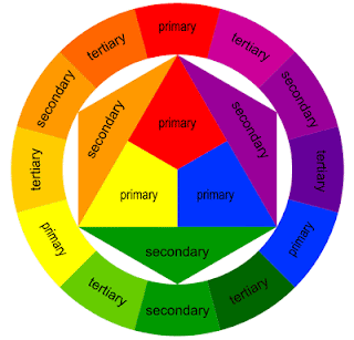
Colour Colour is a wonderful element of design. In many cases, colour is the first thing people notice when looking at a design. Colours can be used to symbolise different meaning and are classified into three groups. Primary Red, Yellow and Blue are the primary colors. These are the three basic colors that are used to mix all hues. SECONDARY COLORS Orange , Green and Purple are the secondary colors. They are achieved by mixing two primary colors together. TERTIARY COLORS Tertiary colors are more subtle colors that are achieved by mixing a primary and a secondary color. OPPOSITE and COMPLEMENTARY COLORS Opposite colors are diagonally opposite one another on the color wheel. You can work out the opposite color to any primary color by taking the other two primaries and mixing them together. The result will be its opposite or ‘complementary’ color. ANALOGOUS COLORS Analogous colors sit next to one another on the color wheel. These colors are in harmony with one another. · White and lighter tints of colour make small shapes look larger. · Warm colours (red, oranges, and yellows) make a shape appear larger. · Black and darker shades of colours make shapes look smaller. · Cool colours (blue, greens, violets) have a slimming effect. Student exercise in blending and matching colours. Print pages off in black and white Students will be asked to use the colour information above to mix and blend colours. Give students a print off of one of the designers, ask them to read the description of colours outlined by the designer. Follow through and create the colours of the outfit. After they have completed this activity show students what the colours should look like. How close were they to the designer? | ||||||||||||||||||||||||||||||||||||||||||||||||
Texture Texture describes the way something feels, such as soft, hard, smooth or rough. It can also describe the way something looks, such as shiny, crumpled, bubbly or dull. Texture adds a three dimensional effect to designs. Texture can also create illusions. For example, smooth, shiny textures can appear bigger, newer and more expensive than rough, dull textures. Texture can also be used to change a person’s appearance. · Clinging fabrics emphasise rounded curves and bumps. · Shiny fabrics reflect more light, so shapes look larger. · Heavy textures add bulk, and increase apparent size. So do stiff, furry, shaggy fabrics. · Dull matt fabrics slenderise, as they do not absorb light. · Lightweight, fine fabrics do not increase size as much as those with a lot of bulk.
Japanese Fashion goes beyond the norm when it comes to combining their colours. Have a look at the video and slide show below. Basic Handstitching | ||||||||||||||||||||||||||||||||||||||||||||||||


No comments:
Post a Comment